What is Gestalt theory?

The more I read into graphic design history the more I realise how hard it is to distinguish a theory from a method. It is thought that this is perhaps because the professional practice of graphic design is actually very young, and that is the potential reason why there isn’t much academic reading on why we do what we do as graphic designers. It’s much easier to find 'how to' guides to create your own forms of communication design, rather than why we adopt those methods and design things the way we do.
One theory I came across, that is thought to have an impact on the practice of graphic, visual and communication design is gestalt theory.
What is Gestalt theory?
Gestalt psychology is an idea that looks at the human mind and behavior as a whole. When trying to make sense of the world around us, Gestalt psychology suggests that we do not simply focus on every small component. Instead, our minds tend to perceive objects as part of a greater or unified whole. This school of psychology played a major role in the modern development of the study of human sensation and perception.The prominent founders of the theory were Max Wertheimer, Wolfgang Kohler, and Kurt Koffka. It originated in the work of Wertheimer who wrote his first paper in 1912. While the principles were developed over a number of years, they came to prominence in part thanks to Rudolf Arnheim's 1954 book, Art and Visual Perception: A Psychology of the Creative Eye.
Understanding how a design is perceived and interpreted is crucial to visual communication. It is thought that the gestalt movement helps designers to understand how viewers make sense of the visual stimuli that we design for them. It is thought that when you apply gestalt approaches to graphics that your design will feel more connected, coherent and complete.
Common gestalt principles used in design
The six most commonly used gestalt theories in graphic design are similarity, continuation, closure, proximity, figure/ground and symmetry/order. I’ll explain each of these in more depth below.SIMILARITY
When objects looks similar to one another, viewers will often see the individual elements as part of a pattern or group. This effect can be used to create a single illustration, image or message from a series of separate elements. The similarity between different elements can be shape, colour, size, texture or value. The more commonality that individual elements have, the greater the sense of coherence, thanks to similarity.A particular element can be emphasized when it's dissimilar, breaking the pattern of similarity. This effect is called an anomaly.
Similarity theory can be applied when laying out a multi-page document. For example, creating a strong type scheme and hierarchy will help readers understand which chunks of text are captions, which are headlines and which are body copy.

(https://naldzgraphics.net/wp-content/uploads/2017/07/2-similarity-categories.jpg)
CONTINUATION
Continuation is the principle through which the eye is drawn along a path, line or curve, preferring to see a single continuous figure rather than separate lines. This can be used to point towards another element in the composition, and is seen where a line is cut through one object, often in a curve, aligning perfectly with a secondary element.Elements are visually associated if they are aligned with each other. Lines are perceived as a single figure insofar as they’re continuous.
The example of the two lines below demonstrates that instead of viewing the elements as four separate lines, our mind works to group them together as an intersecting curved and straight line.

(http://www.graphic-design.com/Gestalt_Principles_of_Graphic_Design)
CLOSURE
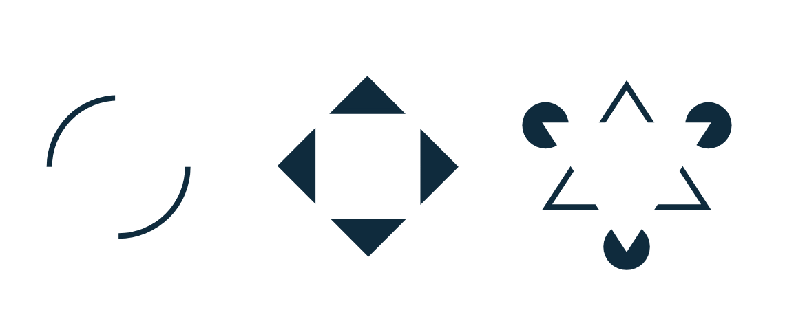
Closure is a common design technique that uses the human eye's tendency to see closed shapes. Closure works where an object is incomplete or the interior space of an element is not fully closed, but the viewer perceives a complete shape by filling in the missing information. This technique is often associated with stencilled artwork, but is also closely associated with logo forms.Closure is related to continuity in that it asks the eye to complete a path. As long as enough essential information is present, the mind supplies the missing pieces of an object. The designer must strike a balance between what is taken away and what remains. The mind cannot complete the object if too much of it is missing.
(https://medium.muz.li/gestalt-principles-in-ui-design-6b75a41e9965)
PROXIMITY
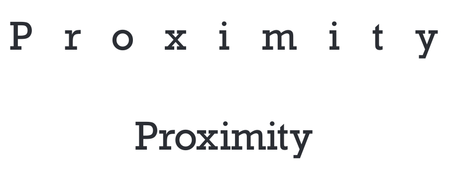
Proximity uses the close arrangement of elements to create a group association between those objects. If individual elements are also similar, they will tend to be perceived as a single whole, even though they are separate elements. Proximity or grouping can be achieved with lots of different commonality including shape, colour, texture, size or any other visual attribute.Proximity spacing can be as close as objects in direct contact, or as far apart as opposite sides of a page. The strongest proximity relationship is when objects overlap, leaving no doubt that they belong together. Using other design elements, such as lines or shapes to surround objects, also creates strong proximity. Lines and shapes can also link objects by passing through them or by underlining them.
Proximity principles can be applied to typographic design, particularly when thinking about proper kerning, this helps the eye understand which letters make up individual words. In some cases, excessive spaces between letters can cause confusion as to when one word ends and the next begins.
(https://www.howdesign.com/resources-education/online-design-courses-education/gestalt-theory-typography-design-principles/)

(http://typographyhandbook.com/assets/images/law-of-proximity.png)
FIGURE/GROUND
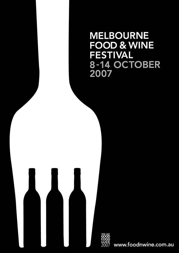
This principle describes the eye's tendency to see and separate objects from their surrounding background. It is based upon the relationship between an object and the surrounding space. Figure/ground is also referred to as positive and negative space, the positive being the object and the negative referring to the space around it.When applied this can be used to create some interesting visual effects and tricks, particularly when the designer introduces deliberate ambiguity. The example below, of the Melbourne Food and Wine Festival poster, demonstrates how the human eyes want to see the fork as the figure (foreground object) and the wine bottles as the background (ground), creating two different planes of focus.
(https://www.behance.net/gallery/950840/Food-Wine-Festival)
SYMMETRY/ORDER
Symmetrical elements are perceived as part of the same group. When figures look like mirror reflections of each other this relationship helps us perceive these elements as a single figure.This principle says that a piece of design should not provide a sense of disorder or imbalance, as otherwise the viewer will waste time trying to order the information or fix the problem, rather than focusing on the message. A good balance or sense of symmetry in your design elements provides the viewer with a feeling of harmony and understanding.

(https://blogs.wayne.edu/waynedotedu/files/2013/06/Screen-Shot-2013-06-26-at-1.35.41-PM.png)

(https://openclipart.org/image/2400px/svg_to_png/133483/Gestalt-symetria.png)
PARALLELISM
Elements with the same or very similar slopes are associated as a single group. When designing a document or poster, we often change the inclination of our texts to match surrounding arrows or curves because it makes the entire figure look more visually compact. In this poster example below, created to advertise the font Futura, different text areas are grouped using the principle of parallelism.

REFERENCES
- Hampton-Smith, S. (2018, December 11). The designer's guide to Gestalt Theory. Retrieved from https://www.creativebloq.com/graphic-design/gestalt-theory-10134960
- Busche, L. (2018, October 24). Simplicity, symmetry and more: Gestalt theory and the design principles it gave birth to – Learn. Retrieved from https://www.canva.com/learn/gestalt-theory/
- Gestalt Theory in Typography & Design Principles. (2016, February 21). Retrieved from https://www.howdesign.com/resources-education/online-design-courses-education/gestalt-theory-typography-design-principles/
- The Gestalt Principles of Design : The most important lesson for all designers | Design | Graphic Design & Publishing Center. (n.d.). Retrieved from http://www.graphic-design.com/Gestalt_Principles_of_Graphic_Design
- Design Principles: Visual Perception And The Principles Of Gestalt. (2014, March 29). Retrieved from http://www.smashingmagazine.com/2014/03/design-principles-visual-perception-and-the-principles-of-gestalt/
- 1005821802895703. (2018, January 16). Gestalt principles in UI design. Retrieved from https://medium.muz.li/gestalt-principles-in-ui-design-6b75a41e9965


Comments
Post a Comment